Loopify
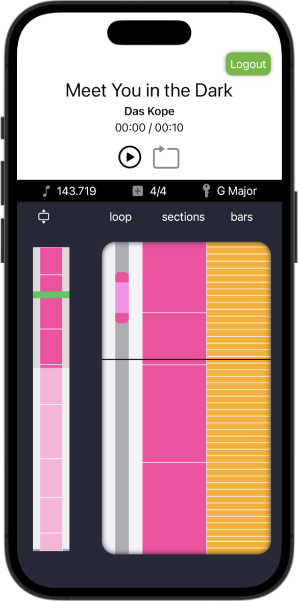
Loopify is my latest app. It’s currently in TestFlight, awaiting approval from Spotify to use its Web API. If you would like access to the beta, please contact me with your Spotify account name.
Loopify was created over a period of 50 days, during which I documented my thoughts on my blog.
What problem does Loopify solve?
I play guitar, drums and piano in my spare time. I believe that one of the best ways to improve musicianship is learning by ear, and so I try to learn new songs this way. Using a regular music player like Spotify for this can be frustrating if I have to repeatedly return to the same place in a track until I get it.
There are other apps that do this, but I’ve found that the UI for most of these a pretty poor. Loopify is my attempt at creating a beautiful, intuitive solution to this problem. It acts as a controller for any device that is playing through Spotify Connect, and so is not limited to the device it’s running on.
Features
The Spotify Audio Analysis endpoint provides both track details and information about bars and sections for songs in its library. Loopify uses this information to provide a more musical understanding of the track.

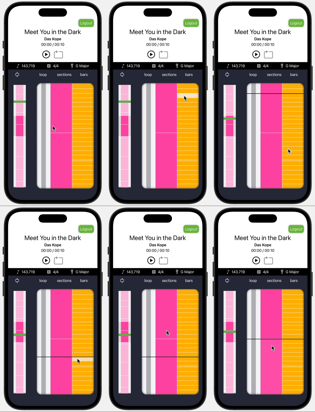
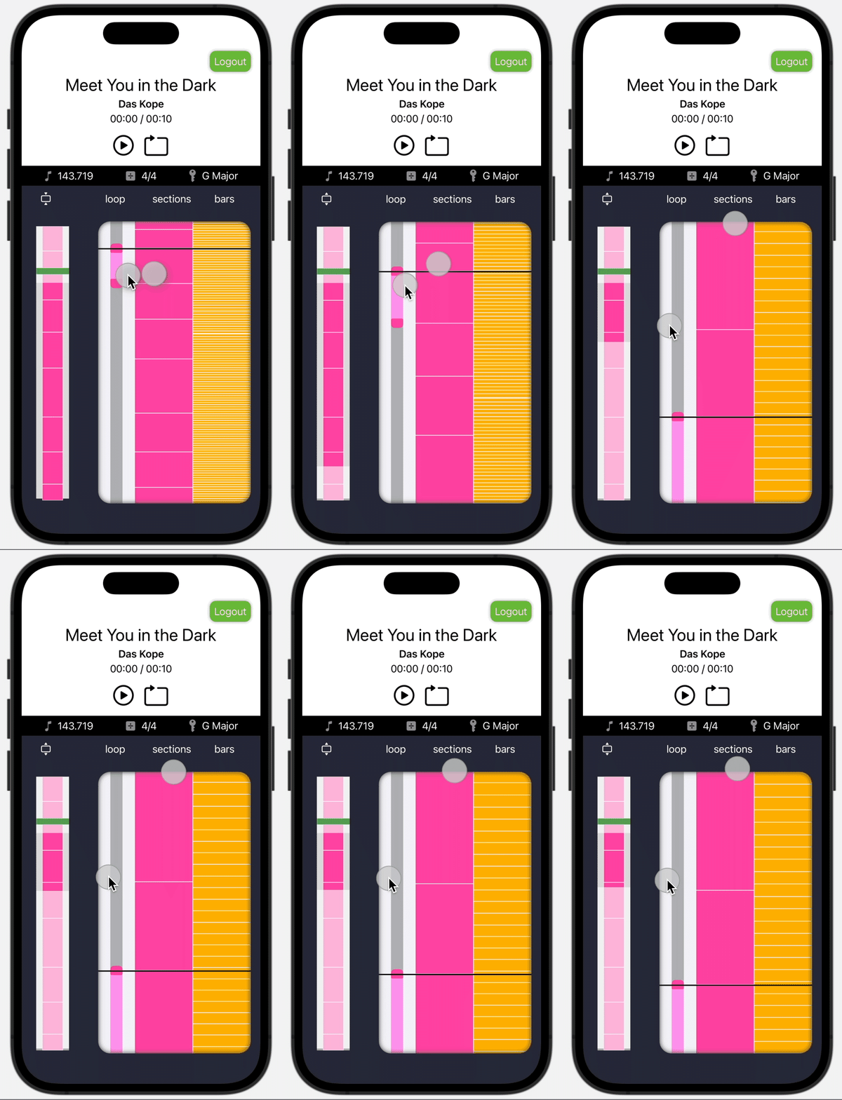
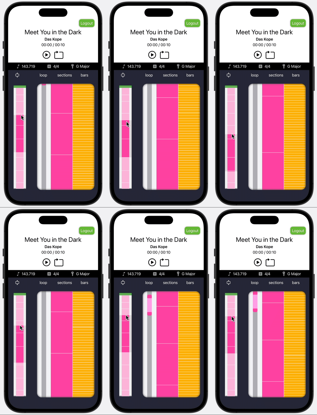
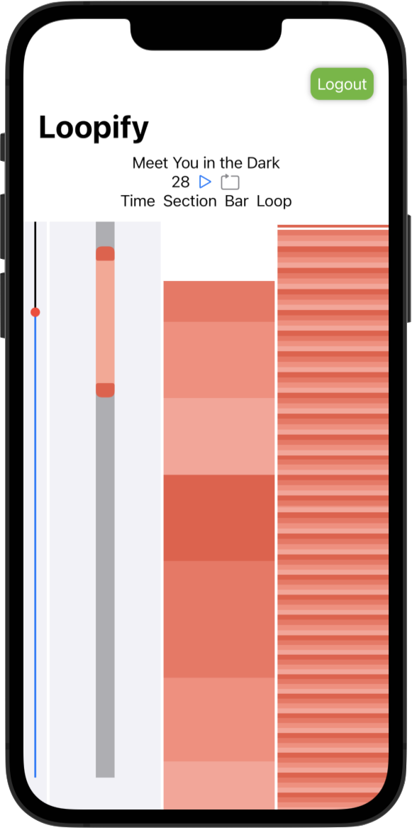
My design for the app features a minimap view on the left, displaying the entire track, with sections, and a moveable playhead. The right-hand pane shows a magnified, zoomable view of the track, which allows users to focus in on specific parts. Single tap a section or bar to seek to that position; double tap to create a loop over that section. Users can fine-tune their loop using the drag handles.

Behind the scenes
Interface
The Loopify UI is very-nearly entirely written in SwiftUI. This is my second project, but the first that I’ve seen through to completion. Declarative programming has been a challenge, but I’ve enjoyed it. Building the UI took a significant amount of time in the project, and I scrapped my initial idea in favour of something that I think is more refined.

API
The first stages of the project were spent trying to figure out which API would be the most suitable. My original concept was to have audio streaming directly to Loopify, which users able to slow down and transpose songs. This would have been a much nicer solution, but unfortunately Spotify announced they were shutting down their streaming SDK just as I started work. As of September 2022 there is no way to access streaming audio outside of the official Spotify channels.
My remaining options were the iOS SDK or the Web API. I built out helper classes for both, but in the end the authorisation flow for the iOS app proved too janky for a good user experience: Users had to be pushed out to the Spotify app to authenticate, and it would only work if the Spotify app was playing music. Instead, I opted for the Web API, which has the added advantage of separating the audio from the device running Loopify, which allows users to control audio wherever it’s playing.
I originally built out a data model and some basic methods for the Web API myself, but after coming across Peter Schorn’s API, I decided to use his more advanced, Combine-based, package. This made it easy to interface with SwiftUI’s state variables.

 Loopify
 StreamCam